Table of Contents
Charting with SQL
In today’s world, knowing how to show and understand data is key. With more data than ever, making it easy to see and understand is more important than ever. This guide will show how SQL can help make your data visualizations stand out.
You’ll learn why data visualization matters and how to make different types of charts. You’ll see how SQL’s strong querying features can help you make your data shine. This will help you create visuals that grab your audience’s attention.
If you work with data, this article is for you. It will teach you how to use SQL to make your data stories more compelling. Get ready to learn how to mix data, SQL, and visuals in a way that changes how you share insights.

Key Takeaways
- Understand the importance of data visualization in today’s data-driven landscape
- Explore the capabilities of SQL as a robust tool for creating captivating data visualizations
- Learn how to leverage SQL’s querying features to unlock the full potential of your data
- Discover various chart types and their use cases to effectively communicate insights
- Gain the skills to create visually striking and impactful data visualizations
Introduction to Data Visualization with SQL
Data visualization turns complex info into something easy to see and understand. We’ll look at why it’s key and how SQL, a strong programming language, helps make great visuals.
Understanding the Importance of Data Visualization
Data visualization is key for making good decisions, sharing info, and finding hidden insights. It turns raw data into charts and graphs that help us see things clearly. This way, we can spot trends and patterns that might be hard to see in text.
Why SQL is a Powerful Tool for Data Visualization
SQL, or Structured Query Language, is great for working with database data. SQL’s data visualization capabilities let you create visuals right from your data. You can make bar charts, line charts, and scatter plots in your SQL queries.
Also, SQL’s data visualization tools are handy for big datasets and sharing insights. Using SQL, you can fully use your data to make smart, informed decisions.
“Data visualization is the presentation of data in a pictorial or graphical format. It enables decision makers to see analytics presented visually, so they can grasp difficult concepts or identify new patterns.”
Setting Up Your SQL Environment
Before we explore the exciting world of SQL data visualization, make sure your SQL environment is ready. This guide will help you pick the best SQL tools and software, set up your database connections, and get the tools to make amazing data visualizations with SQL.
Choosing the right SQL environment setup is your first step. You can choose from desktop SQL clients, web-based platforms, or integrated development environments (IDEs). Popular options include Microsoft SQL Server Management Studio, PostgreSQL, and DBeaver, each with its own features.
After picking your SQL tools and software, set up your database connections. A secure and reliable connection to your data is key for easy exploration and visualization. Learn about connection settings, authentication, and any needed drivers or plugins for your SQL environment.
Lastly, get the right SQL data visualization software and resources. Look into charting and graphing in your SQL environment or use tools like Tableau, Power BI, or Plotly. Keep up with SQL documentation, tutorials, and community resources to improve your data visualization skills.
With a solid SQL environment and the right tools, you’re ready to create engaging, data-driven visualizations. These will help uncover insights and guide informed decisions.
Basic SQL Queries for Data Visualization
Learning SQL is key for anyone wanting to work with data. We’ll look at the basic SQL queries that help create great data visualizations.
Selecting and Filtering Data
To make good data visualizations, you need the right data. SQL’s SELECT and WHERE clauses help you get what you need. They filter out the extra stuff, focusing on what’s important.
By getting good at SQL data selection and filtering, you’re ready to move on to the next step: making your data look good.
Aggregating and Grouping Data
After picking the right data, it’s time to find patterns and trends. SQL’s GROUP BY and HAVING clauses help you do this. They let you group your data in ways that show new insights.
Using SQL data aggregation and grouping turns raw data into something you can visualize. This makes your charts and graphs more powerful.
These basic SQL queries for data visualization are the foundation for more complex and interesting visuals. With these skills, you’re on your way to telling stories with data using SQL.
| SQL Query Type | Description | Example |
|---|---|---|
| SELECT and WHERE | Extracts specific data from a database table, filtering out irrelevant information | SELECT product_name, price FROM products WHERE category = ‘Electronics’ |
| GROUP BY and HAVING | Aggregates and groups data based on one or more columns, allowing for deeper analysis | SELECT category, SUM(sales) AS total_sales FROM sales_data GROUP BY category HAVING total_sales > 1000000 |
“The true value of data lies in its ability to tell a story. By mastering the fundamental SQL queries for data visualization, you unlock the power to transform raw information into captivating narratives that inspire action and drive progress.”
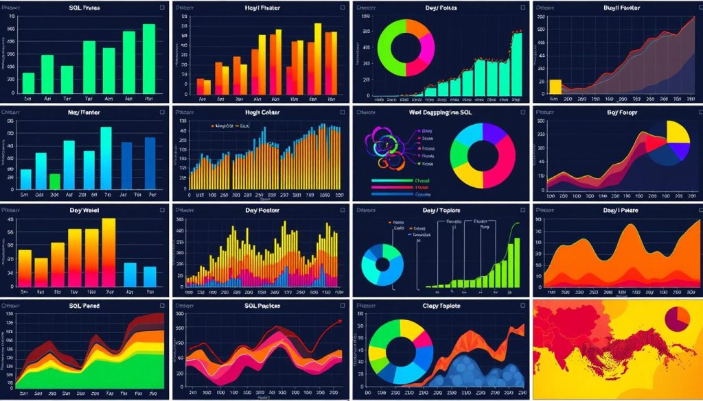
Charting with SQL
SQL (Structured Query Language) is now a key tool for making charts and graphs. It lets you use the data in your databases to create many SQL data visualization chart types. These charts help share your findings clearly.
Different Types of Charts and Their Use Cases
SQL offers many chart types, from simple bar charts to complex line charts. Each chart has its own use, fitting different data and analysis needs.
- Bar Charts are great for comparing different things, showing how they stack up.
- Line Charts are best for showing trends over time, perfect for analyzing data that changes.
- Pie Charts clearly show how parts add up to a whole, making it easy to see what’s big and what’s small.
- Scatter Plots help find connections between different things, revealing how they might affect each other.
These are just a few examples of SQL chart use cases. Each has its own strengths in showing data and telling stories. By learning SQL-based data visualization techniques, you can make charts that tell your data’s story well and help you make better decisions.
“The true alchemists do not change lead into gold; they change the world into words.” – William H. Gass
Creating Bar Charts with SQL
Bar charts are a great way to compare values in different categories. SQL helps you make these charts. It lets you create SQL bar charts that tell your data’s story well.
Using SQL for SQL-generated bar charts has big benefits. You can get data straight from your database. This makes your charts accurate and dynamic, without extra steps.
To make a data visualization with SQL bar charts, you need to write good SQL queries. You’ll pick the right columns, group data, and sort it. This makes your chart show what you want.
- First, decide what you want to show in your bar chart.
- Write a SQL query to get the data you need, like labels and values.
- Use SQL functions like
SUM(),COUNT(), orAVG()to sum up your data. - Sort your results in a way that makes sense for your chart.
With your data ready, you can use it in your favorite data tool. SQL helps you make SQL bar charts that show your data’s insights clearly.
For great data visualization with SQL bar charts, know your data well. Write smart queries and make your charts look good. With practice, you’ll get better at using SQL for data visualization.
Building Line Charts with SQL
Let’s explore the exciting world of SQL-generated line charts. These charts are great for showing trends and patterns. They are perfect for analyzing data over time.
Visualizing Time-Series Data
Line charts are excellent for showing changes over time. They help you find important insights in your SQL data. You can track sales, website traffic, or financial metrics easily with these charts.
To make these charts, use SQL’s aggregation functions and date/time functions. Group your data by time and plot the values. This way, you can see trends and patterns clearly.
Using SQL for line charts has a big advantage. You can add these charts to your reports and dashboards easily. This makes your data presentation consistent and clear across your organization.
“SQL-generated line charts provide a powerful way to communicate changes over time, enabling you to uncover valuable insights from your data.”
We will learn more about making and customizing SQL line charts. You’ll get the skills to create beautiful and meaningful data visualizations.
Generating Pie Charts with SQL
Pie charts are great for showing how different parts of your data relate to each other. SQL lets you make SQL pie charts that are both pretty and tell a story with your data.
One big plus of SQL-generated pie charts is you can make them right from your database. This means you don’t need extra tools. Your charts will always show the latest data.
Steps to Create Pie Charts with SQL
- First, pick the right data from your database with a SQL query. This query should group the data and figure out the proportions.
- Use SQL functions like
SUM()andCOUNT()to add up the data. This helps figure out what each slice of the pie chart should be. - Make the query output easy to turn into a pie chart. Include labels and values for each slice.
- Put the SQL pie chart data into your app or tool. This makes your data visualization with SQL pie charts look good and tell a story.
Learning to make SQL pie charts opens up a world of data analysis and storytelling. These charts are great for showing sales, demographics, or other data. They give you insights quickly.
“Data visualization is not just about making pretty pictures – it’s about extracting meaningful insights from complex data and communicating them effectively.”
As you explore SQL pie charts, remember to follow design best practices. Use clear labels, pick good colors, and make sure the sizes are right. This way, your SQL-generated pie charts will grab your audience’s attention and help them understand your data better.
Scatter Plots and Correlation Analysis
In this final section, we’ll explore scatter plots and correlation analysis. Scatter plots are great for finding patterns and outliers in your data. They help uncover hidden relationships and insights. We’ll show you how to make scatter plots with SQL and how to understand the results.
Identifying Patterns and Outliers
Scatter plots show the relationship between two variables. They help spot trends, patterns, and outliers. By plotting two columns from your data, you can see the strength and direction of the correlation. You can also find anomalies that need more study.
To make a scatter plot with SQL, you need to use SELECT statements, JOINs, and math functions. These steps help you see how variables relate to each other. They also highlight areas for deeper analysis.
FAQ
What is the importance of data visualization?
Data visualization is key for better decision-making and clearer communication. It makes complex data easy to understand and share. This helps everyone see the insights hidden in the data.
Why is SQL a powerful tool for data visualization?
SQL is great for data visualization because it works well with databases. It can handle complex data and create visuals from queries. This makes it a strong tool for creating engaging data visualizations.
What are the essential steps to set up my SQL environment for data visualization?
First, pick the right SQL software or platform. Then, set up your database connections. Make sure you have the tools and resources needed to create data visualizations with SQL.
What are the fundamental SQL queries for data visualization?
You need to learn how to select and filter data. Also, know how to aggregate and group data. These skills are the foundation for creating detailed and interesting charts and graphs.
What are the different types of charts and their use cases?
SQL supports many chart types for different needs. Bar charts are good for comparing values. Line charts show trends. Pie charts display proportional data. Scatter plots find patterns and outliers.
How do I create bar charts with SQL?
To make bar charts, use SQL to pick and sum up the right data. Then, use SQL functions or tools to show the data as a bar chart.
How do I build line charts with SQL?
For line charts, focus on time-series data. Order the data by time and use SQL functions or tools to create the chart.
How can I generate pie charts with SQL?
To make pie charts, write queries to find the share of each category. Then, use SQL functions or tools to display the data as a pie chart.
How can I create scatter plots and perform correlation analysis with SQL?
Scatter plots help spot patterns and odd data points. Use SQL to get the data points and analyze them. This way, you can find hidden connections and insights.